ConstraintLayout In Jetpack Compose

It’s been a year since we got the first stable release of jetpack compose and from its first release we know how good it is to write code in jetpack compose. We can achieve so much more in jetpack with less code as compared to the old view system.
ConstraintLayout:
ConstraintLayoutis a layout that allows you to place composables relative to other composables on the screen. It is an alternative to using multiple nestedRow,Column,Boxand custom layout elements.ConstraintLayoutis useful when implementing larger layouts with more complicated alignment requirements.
So 💁🏻, In a nutshell, Jetpack compose ConstraintLayout is similar to the ConstraintLayout that we have already used in our legacy view system. We can position our composable element relative to its sibling composable and/or its parent. Also, we can avoid multiple nesting of custom layout elements like Row,Column etc. and write much more readable code.
To use ConstraintLayout in compose, we need to add its dependency in build.gradle along with the jetpack compose dependency.
def compose_version = "1.0.1" //update it with the latest version
implementation "androidx.constraintlayout:constraintlayout-compose:$compose_version"
To see how ConstraintLayout helps in real life we are going to convert a simple composable layout shown below (build with row and column) to ConstraintLayout. 😎

Let’s Code… 🧑🏻💻
Here we have used a Row to wrap user image, a Column which contain two Text composable for our title and subtitle and lastly, an Icon for the action button.
Let's see how we can avoid nesting of Row and Column here using ConstraintLayout.
Here, (As obvious 🤓) we have used ConstraintLayout as our root layout. On line 10 we created four references using createRefs() and assigned them to each composable accordingly.
In each composable, we have used constrainAs() a modifier where we use these references to position the composable relative to other composable and/or its parent.
And guess what our new layout looks like…..
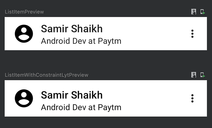
Just like the old one 😉.
Note: Maintaining a flat view hierarchy for a better performance is not a concern in Compose.
ConstraintLayout is great, isn’t it? but that's not it. It provides different methods/features that help us build more interactive designs.
- Guidelines
- Barriers
- Chains
Guidelines:
Guidelines are small visual helpers. In easy words, some invisible lines that we can create and use to position a composable element at a specific dp or percentage inside the parent composable. We can create vertical and horizontal guidelines using the following methods.
// Create guideline from the start of the parent at 50% the width of the Parent Composable
createGuidelineFromStart(0.5f) // Create guideline from 16 dp from the end of the parent
createGuidelineFromEnd(16.dp) // Create guideline from 16 dp from the top of the parent
createGuidelineFromTop(16.dp)// Create guideline from the bottom of the parent at 10% the height of the Parent Composable
createGuidelineFromBottom(0.1f)
To see it in an action we are going to build the following UI in compose.
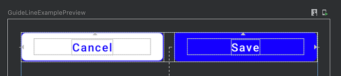
Here we are positioning two buttons in such a way that each of them occupies 50% width of the parent.
Let's see this in the code. 👀
Here, we have used createGuidelineFromStart(0.5f) to create a vertical guideline from the start of the parent at 50% of the width. If you look at the above UI screenshot closely, you will find a vertical dashed line (Yes, it’s our guideline) in the middle.
For the Cancel button, we have linked its start to parent.start and end to middleGuideline. Similarly, for the Save button, we linked its start to middleGuideline and end to parent.end. To occupy the available width we have used width = Dimenstion.fillToConstraints in both the composable (i.e. cancel and save button).
Barriers:
Barriers create a virtual guideline by taking the maximum width or height of reference composable on a specific end.
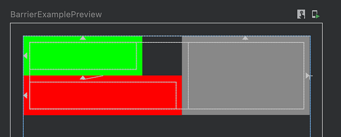
Let’s understand this with a diagram.


So in the above image we have two boxes on the left-hand side called First Box and Second Box and we have a Third Box that we are placing at the extreme edge of either first box or second box. Here, the barrier helps us to find the extreme edge on the left-hand side and we don’t have to do any calculations to find starting position of Third Box.
Let's see some code examples for Barriers. 🧐
On line 12 we have created a barrier using createEndBarrier() and passed references to the green and red boxes in it. To align Gray Box (Third box) we have linked it start to endBarrier (i.e. Line 44).
If you preview this in the android studio it will look something like this.
Just like guidelines, we can create vertical and horizontal barriers using the following methods. createTopBarrier(), createBottomBarrier(), createEndBarrier(), createStartBarrier() .
Chains:
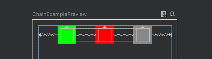
Chain is used to manage spacing between the composable elements in a group on a single axis (horizontally or vertically). To do that these composable should have constraints on each other. We can create a chain using createVerticalChain or createHorizontalChain method, both of them accept references to composable present in the chain and a ChainStyle.
ChainStyles is used to deal with the spacing between composable in a chain. Right now we can create 3 types of chains.
ChainStyle.Spread: As the name suggests, it spread space evenly across all the composable in the chain including free space before the first composable and after the last composable.
ChainStyle.SpreadInside: Here, Space is distributed evenly across all the composable in the chain. It doesn’t leave any space before the first composable and after the last composable.
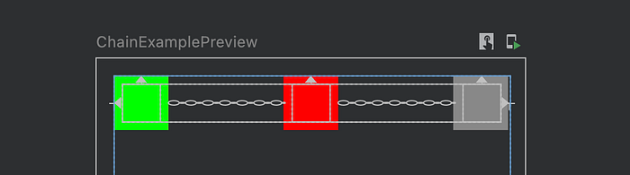
ChainStyle.Packed: It distributes space before the first composable and or after the last composable and doesn’t leave any space between the composable elements and places content in the middle of the parent.

ChainStyle.PackedWe can also pass bias (a float value between 0 to 1) inChainStyle.Packed . where 0 will place the group of composable at the start of the screen and 1 will place the group of composable at the end of the screen. Here, default bias is 0.5f which places the composable in the middle.
I hope 🤞🏻 you enjoyed reading my article and learned something new. If you like this article give it a clap and share it with your android buddies. Also, if you have any suggestions or want me to cover any topic, feel free to drop a comment.
Thank you!✌️
